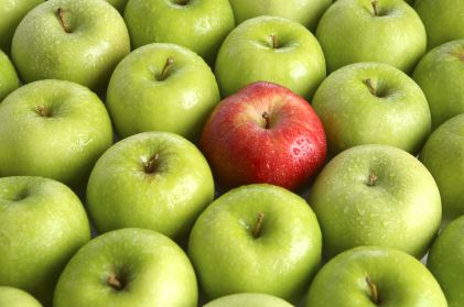
It is showing contrast by having a red apple in a bunch of green apples.
From: Graphic Design Fundamentals

It is the arrangement of items on the page so that one side is not weighted heavier than the other.
Balance is showing two side of a picture that can be split in half and still look the same.
From: SlideShare Blog
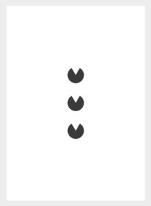
This is showing Unity/Proximity because it is showing closeness of objects.
From: Graphic Designer in Kenya
Alignment is showing that two things are aligning together.
From: Pinterest
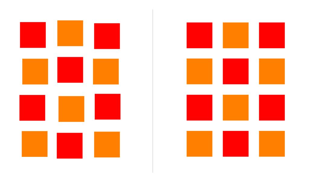
Keeping design uniformity with text, picture elements, and design styles allows the viewer to flow easily through your designs.
Repetition is showing multiple things being repeating.
From: Designorate

Its showing the company in white space simply.
From: The Visual Representation Guy In terms of art, white space can be referred to as negative space . It is the portion of a page left unmarked.
Its showing the company in white space simply.
From: The Visual Representation Guy
