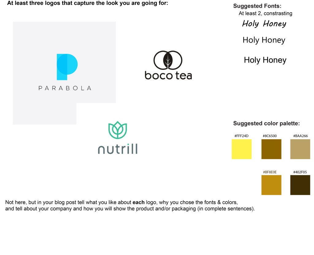
I like the Parabola logo because the letters are spaced out and are really easy to read. I like the boco tea logo because its very simple and the font is easy to read. Finally, I like the nutrill logo because because it is very appealing to the eyes and has very nice colors. I will show my logo on a honey jar. I chose my fonts because they are easy to read and you can read them from afar. I chose my color pallette because the colors look like honey and honeycomb.
